Home » Frutiger Aero: Y2K’s Beloved Aesthetic

Frutiger Aero: Y2K’s Beloved Aesthetic

Image sample of Frutiger Aero graphics
Last Updated on December 11, 2024 by Jake Whitlock

Frutiger Aero​ and the vibe that it embodies is not science fiction, it’s an aesthetic!​

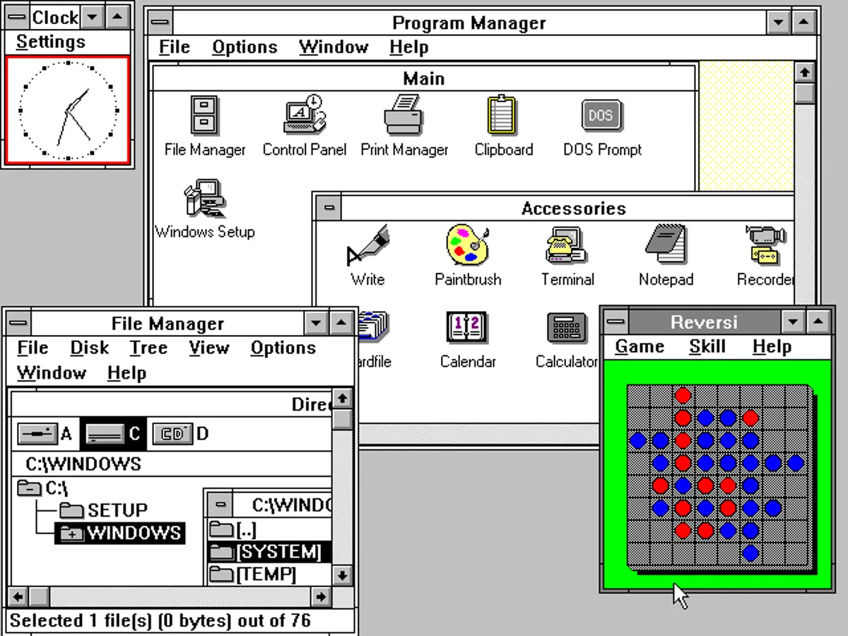
Remember the early days of using a computer? Clunky confusing UI, with gray boxes, blocky buttons, and text that felt sterile and dull. Navigating your PC could be an exercise in frustration, like trying to read a map in a foreign language as you try to forge your path to technological literacy. Technology felt distant, mechanical, and almost alien. But then something changed that introduced us to some old games worth playing and some pretty cool aesthetics.
Suddenly, technology felt more vibrant and approachable. Your computer seemed to come alive, inviting you into a digital world that wasn’t just about function, but beauty. And it wasn’t just tech that embraced this look; media, advertising, and video games all followed suit, creating a rich, harmonious experience that felt both futuristic and inviting.
An image of Windows 3.0 and its user interface sampled by Fruiger Aero
With sans-serif typefaces and tertiary color palettes accompanying these ethereal imagery, Frutiger Aero became synonymous with the tech optimism of the 2000s. Though its peak was over a decade ago, this aesthetic has made a comeback in recent years, thanks to nostalgia and the allure of a simpler, more hopeful digital world. On Reddit, a subreddit dedicated to the Frutiger Aero aesthetic has grown with almost 35,000 subscribers. 
 
While on YouTube, analysis videos breaking down Frutiger Aero and playlists capturing the aesthetic are popping up everywhere. TikTok users have rediscovered it, and hashtags like #FrutigerAero have racked up millions of views reviving an aesthetic that many of us associate with our first explorations of the internet as well as enticing the new generation that has not experienced this trend shift first-hand. 
 
But what exactly is Frutiger Aero? How did it come to be, and why is it back now?

The Visual Identity of Frutiger Aero

A sample image of the Frutiger Aero design
Also known as Web 2.0 gloss or Digital Dream Utopia, Frutiger Aero was the defining design style from 2004 to 2013. Sofi Lee, a member of the Consumer Aesthetics Research Institute (CARI), an online community that archives visual aesthetics in consumer culture since the 1970s, was the first to identify this style. She coined the name by combining two key influences: the Frutiger font family designed by Adrian Frutiger and Windows Aero, the design language of Windows Vista. Lee explains that other iconic aspects of Frutiger Aero include bokeh effects, aurora borealis, globes, and glassy, transparent materials, grassy landscapes, clear blue skies, and virtual elements mimicking real-life objects.
 
Evan Collins, also from CARI and a researcher of popular aesthetics like Y2K and McBling, believes companies embraced this style to make technology feel more approachable. With the rise of touchscreens on iPads and iPhones during this period, Evan thinks the glossy, jelly-like, glowing interfaces that mimicked physical materials played a role in helping users acclimate to touch-based interactions. This design concept is called Skeuomorphism, where the items inside the aesthetic strive to resemble their real-world counterparts for user-friendly experience. For example, a user will find it is to find their alarm app if the image accompanying the alarm app is a clock.

The Origins of Frutiger Aero

The iconic Windows XP desktop background is a textbook example of the Frutiger Aero design
Image Source: Microsoft

The earliest signs of Frutiger Aero can be traced back to 2001 with the release of Microsoft’s Windows XP and Apple’s Mac OS X 10.0. The iconic “Bliss” desktop background of XP and the skeuomorphic design of OS X, initially derived from early versions of iMovie, have been noted by some as precursors to the aesthetic. However, both are also categorized as part of the Y2K Futurism era. 

During this time, Microsoft began developing Windows Longhorn (later renamed Windows Vista), gradually introducing elements that would evolve into the Windows Aero theme. Early iterations of Frutiger Aero (2002–2005) still carried many visual motifs from the Y2K aesthetic, but by the mid-2000s, its distinct identity started to take shape. This period also marked the mainstream introduction of aesthetic through releases like Windows Media Player 10, Windows XP Media Center Edition 2005, and the Nintendo DS.

By 2007, Frutiger Aero was fully established with the launch of Windows Vista, the first iPhone (iPhone OS 1.0), and Mac OS X Leopard (10.5). The aesthetic became widespread, with its nature-inspired and glossy design elements seen as “humanizing” technology in contrast to the edgier, sci-fi-inspired visuals of Y2K Futurism. The 7th generation of video game consoles, including the Xbox 360, PlayStation 3, and Nintendo Wii, also helped cement its dominance. 
 
During its peak (2007–2012), Frutiger Aero influenced everything from advertising and media to stock imagery and technology, embodying a sleek, futuristic look that was polished and corporate. It overlapped with other aesthetics like McBling, Surf Crush, and ElectroPop 08, and as its influence grew, various sub-aesthetics began to emerge under the broad umbrella of Frutiger Aero.

The Inevitable Decline of an Era-Defining Aesthetic

While Frutiger Aero was everywhere in the mid-2000s, it eventually fell out of favor as flat design took over in the 2010s. Flat design, with its minimalistic and corporate look, marked a stark departure from the bright, glossy optimism of the Frutiger Aero era. Some companies opted for Frutiger Metro at first, but then later changed to to said design.
 
Flat design stripped away the vibrant colors and utopian visions of Frutiger Aero, instead favoring simplicity, dull tones, and functionality. By 2013, Flat Design had begun to overshadow Frutiger Aero, with the release of iOS 7 being a key turning point. In 2017, the emergence of Corporate Memphis, a minimalist web and tech aesthetic, signaled the official decline of Frutiger Aero.
 
Despite this, elements of Frutiger Aero can still be found today, particularly in retail packaging for medical and cleaning products, school textbooks, and to a limited extent, TV channel logos in some countries across the globe.

Frutiger Aero's Appeal Today And It's Promise of Tomorrow

An image of a media player with the Frutiger Aero design.

There’s more to Frutiger Aero than meets the eye. On the surface, it’s a shiny, bubbly aesthetic that combines technology with nature, but it represents something deeper: a vision of a better future. In the early 2000s, technology was advancing at an incredible pace, and people were genuinely excited about what it could do for humanity. Frutiger Aero encapsulates this optimism, showcasing a world where technology seamlessly integrates with the natural world to create something beautiful and harmonious.

Today, Frutiger Aero serves as a nostalgic reminder of a time when technology seemed full of endless possibilities and promise. In a world that often feels bleak and cynical, this aesthetic offers a refreshing escape to a more hopeful vision of the future. It’s no surprise that so many people are drawn to it again. However, there’s a divide online about how to approach this design concept. 
 
Some argue it’s just another marketing scheme, designed to make people believe that technology is essential not for humanity’s advancement, but for profit-driven motives. On the other hand, the new generation often feels a sense of melancholy for a future they never experienced, a vision of technological optimism that was never fully realized.

Why This Type of Aesthetic Matters

Frutiger Aero’s resurgence is a testament to the power of aesthetics. Far from being mere internet trends, aesthetics play a crucial role in shaping our culture and expressing our values. They reflect the aspirations and anxieties of the time, and in the case of Frutiger Aero, they offer a hopeful vision of what the future could be.
 
As we revisit the glossy, utopian imagery of the early 2000s, we’re reminded of the optimism technology once inspired. Though the world today may be far from the harmonious future Frutiger Aero envisioned, its resurgence serves as a comforting reminder that hope and optimism still have a place, even if only briefly. Perhaps this aesthetic could inspire a new movement, rekindling the idea of a more hopeful, technology-driven future.
 
To go off in a bit of a tangent over here, many would agree that the beautiful aesthetics of Snowbreak: Containment Zone is one of the reasons why it’s popular. Aesthetics, regardless of what style it is, absolutely matters.
 
Here’s a video that poses a very simple question, asking, “What if we still used Frutiger Aero?”:

Do You like Frutiger Aero's Aesthetic?

Next time you come across a meme or an image that transports you back to the shiny, utopian world of early 2000s tech, you’ll know that it’s Frutiger Aero, an aesthetic that was more than just a visual trend. It represented a hopeful vision of the future, where technology and nature could exist in perfect harmony. 

What are your thoughts on this? Would you like for an aesthetic similar to Frutiger Ero to come back? Let us know in the comments below.

Be sure to read our other feature articles to keep up with what’s hot and what’s not in the gaming world. Stay tuned and catch the gaming current with GameEels!